Agilence Feature Designs: Case Study
Dashboard KPI Widget Redesign
Introduction
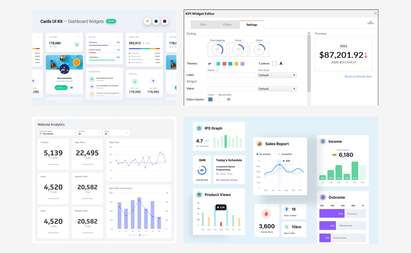
Widgets are currently a feature on the analytics product where customers can add a widget to their dashboard. The widget is a snapshot for users to immediately see a highlighted value.
Currently, widgets are structured so the user selects the background color and widget icon to be presented on the left half of the frame, and then selects the data to be drawn to be displayed on the right. The text displayed is a key value (in large font) and a title associated with it to label what the value pertains to.

Goals While Redesigning
The current widgets feature doesn’t have much for the user to interact with or gain from it – primarily, the goal was to add a feature so a customer could drill down into more specific data points on the widget itself. This, however, turned into an entire widget redesign, as questions arose about the functionality of the features within the widget and what a user should be able to take away from it.
Research Process
The research process began with internal research – my colleague had presented me with this redesign project and she had also brought up many insightful questions that helped lead the direction I was to head towards. Next was market research – currently there is a vast number of KPI widgets used online, and I took notes on how different widgets had been set up. Some used a two column layout with a minimal graph on the right hand side, but most had a simple value presented with a lot of white space for an easy view. The market research was helpful in figuring out how to lay out the features of the widget in an appealing way, retaining the simplicity in which a widget needs to have.

Design Stages

The design process for this feature ran stage by stage with new feature additions added or changed each step.

The Final Product


